![](https://nicolewaldern.com/wp-content/uploads/2019/02/utmainArtboard-32-8-1.png)
Utransfer
- 6 Weeks
- Case Study
- UX
- UI
Context
A common issue college and university students face after deciding to transfer to a new post-secondary institution is information overload. The process requires hours of research after which they still can not be certain they will be making the best use of the credits they have already obtained.
Goal
Help students compare which post-secondary institutions and programs make the best use of a students currently established credits.
Key Takeaways
- Prioritization of potential features at the beginning stages of design is important in directing the flow of design
- Acknowledge and minimize your own bias by performing external research tactics such as co-creation, interviews and surveys
- Understanding the user and their needs before solving the problem helps to develop user-centred designs
The Application
![](https://nicolewaldern.com/wp-content/uploads/2019/02/ut3Artboard-32-8-1.png)
Discover
Discover news and events regarding Canadian post-secondary institutions and programs. Students will have access to university rankings, new program postings, and any other news of interest to students interested in transferring across Canada. They will also be able to search through profiles for post-secondary institutions giving them an overview of information.
Compare
Compare which post-secondary institutions and their programs will accept the most of a students currently established credits. By clicking on each of these options, details of which courses apply and which do not will appear based on an individual students settings.
![](https://nicolewaldern.com/wp-content/uploads/2019/02/ut1Artboard-32-8-2.png)
![](https://nicolewaldern.com/wp-content/uploads/2019/02/ut2Artboard-32-8.png)
Connect
Easily find and connect with student advisors for specific programs across the country. Ask any questions related to the program of interest to avoid any ambiguity.
Ideation and Research
![](https://nicolewaldern.com/wp-content/uploads/2019/02/CardsArtboard-1-8.png)
The Approach
During the initial stages of ideation I found it very important to keep the users at the forefront of discussion to adhere to the approach of user-centered design. It is my main priority to check in at each stage and ask, ‘who is this helping?’. While also considering all stakeholders that the solution effects. Throughout this stage I used the methods of interviews, empathy maps, creating a value proposition canvas, and co-creation.
Interviews
The transfer process can vary for individuals depending on their specific career goals, this made it very important to discover key insights by sitting down and speaking with those who had been through the process and who were currently going through transferring.
After interviewing four students who had transferred to separate institutions and one student who was currently striving towards transferring I was able to validate some of my assumptions from the ideation stage. I also discovered new challenges that I was not aware of before.
![](https://nicolewaldern.com/wp-content/uploads/2019/02/goalsArtboard-1-8.png)
![](https://nicolewaldern.com/wp-content/uploads/2019/02/insightsArtboard-2-8.png)
Creating a Structured Design
Use Case 1: Login/Register
![](https://nicolewaldern.com/wp-content/uploads/2019/02/usecase1Artboard-38-8-1.png)
Use Case 2: Discover
![](https://nicolewaldern.com/wp-content/uploads/2019/02/usecase2Artboard-39-8.png)
Use Case 3: Compare
![](https://nicolewaldern.com/wp-content/uploads/2019/02/usecase4Artboard-40-8.png)
Use Case 4: Connect
![](https://nicolewaldern.com/wp-content/uploads/2019/02/usecase4Artboard-41-8.png)
Wireframes
![](https://nicolewaldern.com/wp-content/uploads/2018/12/wf2-678x1024.png)
Branding
![](https://nicolewaldern.com/wp-content/uploads/2019/02/logoArtboard-35-8-979x1024.png)
Logo
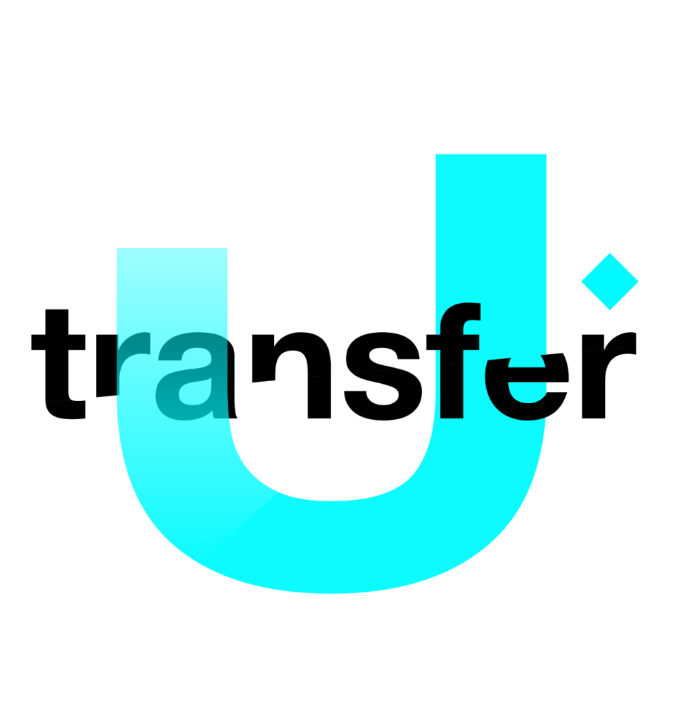
There was a lot of symbolism in mind when creating the Utransfer logo; ‘U’ symbolizes the students journey on their path to discover their careers and themselves. The U shows users that they have the power to sort out and gain this information for themselves. The letters that are slightly disconnected symbolize the unexpected turns that many journeys can take. Lastly, the diamond over the ‘r’ symbolizes the graduation cap at the end of the journey, the goal students are striving towards.
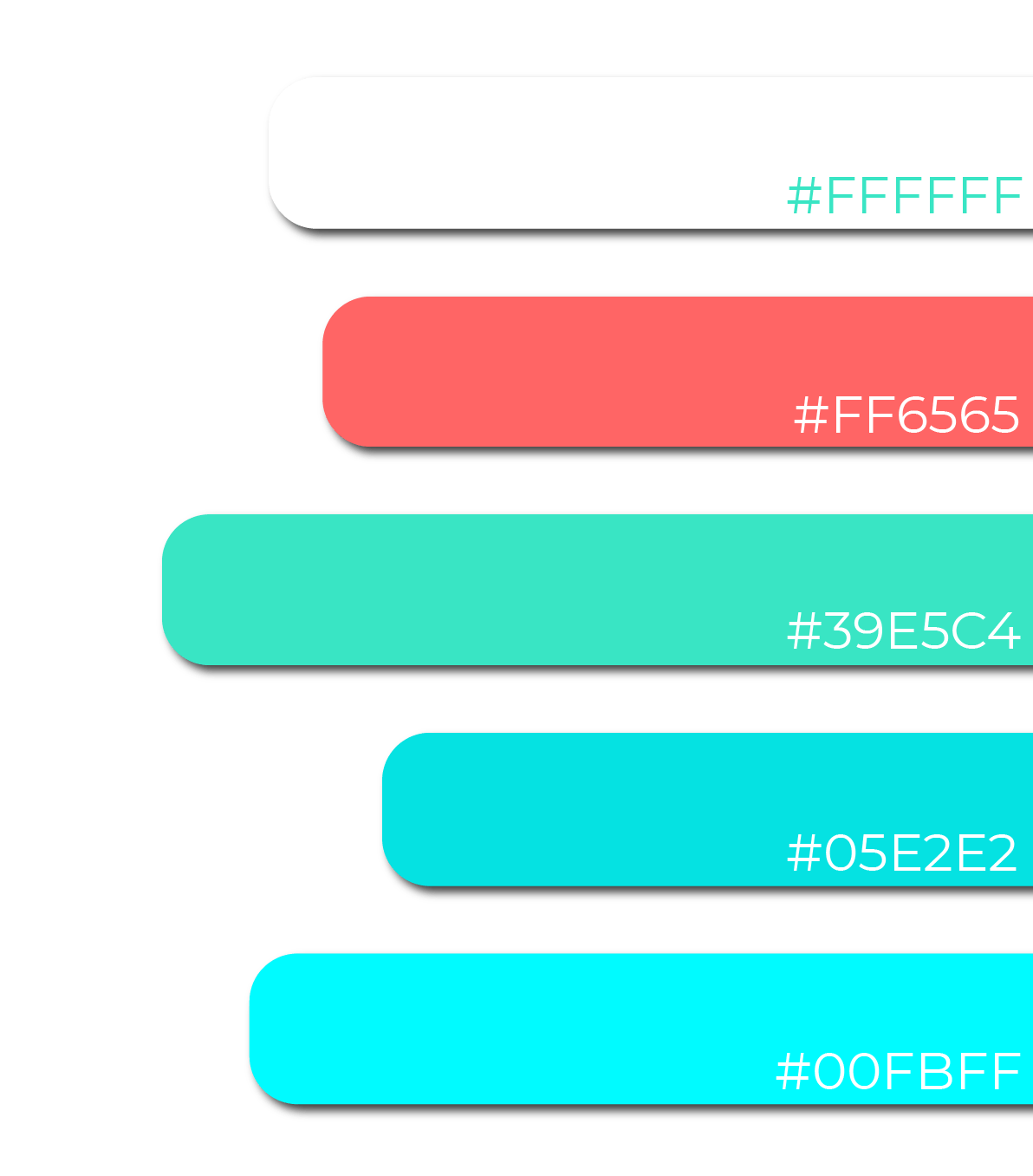
Transparency was used to adhere to accessibility guidelines and assure the text is readable.
Colour Scheme
The colour scheme takes advantage of contrasting colours to create a pop, as well as colours that are similar in saturation to compliment each other. The green is the most used colour as it represents wealth and stability in colour theory.
![](https://nicolewaldern.com/wp-content/uploads/2019/02/coloursArtboard-34-8.png)
Addressing Assumptions
- Students heavily value their time
- More can be done to link students with necessary schools, program, and course information in order to make an informed decision during the transferring process
- Many students are currently unaware of the current resources available to navigate this process
- Students only want the information that is necessary to them in their individual situation
Future Considerations:
- Due to time constraints I was only able to complete the mobile version of the design, this solution would work best as a progressive web app as students do much of their research online when considering new post-secondary institutions meaning a web version is still necessary
- An advisor portal would be necessary for communicating with students through the application, as well as a report/block function to reduce abuse or pranking